
Designing for Research: Reimagining HCI@UCD
Designing for Research: Reimagining HCI@UCD
Designing for Research: Reimagining HCI@UCD
Establishing a new identity to showcase interdisciplinary research and foster collaboration for HCI@UCD Research Group at University College Dublin, IE
MY ROLE
Service + Product Designer
TEAM
2 UX.UI Designers | 1 UX Writer | 1 Product Manager
STAKEHOLDERS
HCI@UCD, University College Dublin, IE
PRODUCT
EdTech | UX for Research Communication
TIMELINE
12 weeks
CONTRIBUTIONS
Design Lead | Benchmarking, Branding Guidelines, Heuristic Evaluation, Low-fidelity Prototypes, Hi-fidelity design, User Flows, UI Design
* the challenge
* the challenge
HCI@UCD is an interdisciplinary research group spanning the Schools of Computer Science and Information and Communication Studies at University College Dublin, IE. The goal of this project was to redesign the group’s public-facing website to better reflect its creative, collaborative research culture and to foster broader engagement with students, researchers, and external partners.
HOW MIGHT WE
redesign the HCI@UCD website to clearly showcase its interdisciplinary research and people while encouraging broader engagement?

* the proposed intervention
* the proposed intervention
The redesign of the HCI@UCD website transforms a static and text-heavy academic platform into a dynamic, engaging, and user-centered experience. Rooted in principles of accessibility, clarity, and visual storytelling, the project reimagined how the interdisciplinary research group presents its people, projects, and values. By streamlining the information architecture and introducing a modern, scalable design system, the new website now better supports collaboration, discoverability, and public engagement.
Jump to SEE THE FINAL DESIGN
* the impact
* the impact
The visual redesign has had a transformative impact on the HCI@UCD website, enhancing usability, engagement, and representation. It not only aligns with the group's identity and values but also provides an intuitive, user-centered experience that supports their collaborative and public-facing goals.
01
improved brand representation and visual identity
intersection of sleek minimalism with abstract visuals, reflecting both the research and design aspects of the HCI group
visuals make the site memorable and representative of the group’s mission
02
enhanced readability and content accessibility
consistent layout across components and pages
visual cues and sectioning (e.g. colored backgrounds, icons, symbols) reduce cognitive load and enhance content discoverability
03
improved user engagement and interactivity
strategically placed CTAs now improve user flow and engagement with content such as research, testimonials, and podcasts
design keeps focus on content without overwhelming users
* discover
* discover
heuristic analysis of the existing design
A heuristic evaluation of the existing HCI@UCD “Home, Publications, People” pages based on Nielsen’s 10 Usability Heuristics was conducted. It revealed significant usability issues, including limited visual storytelling, poor navigation structure, and minimal opportunities for user engagement. Each has been elaborated below:
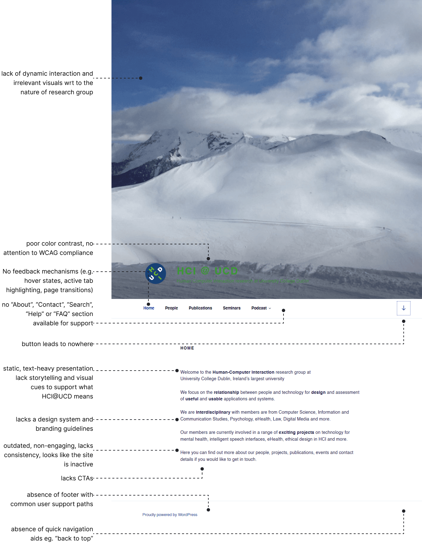
HCI@UCD : Home, Publications, People_Nielsen’s 10 Usability Heuristics evaluation
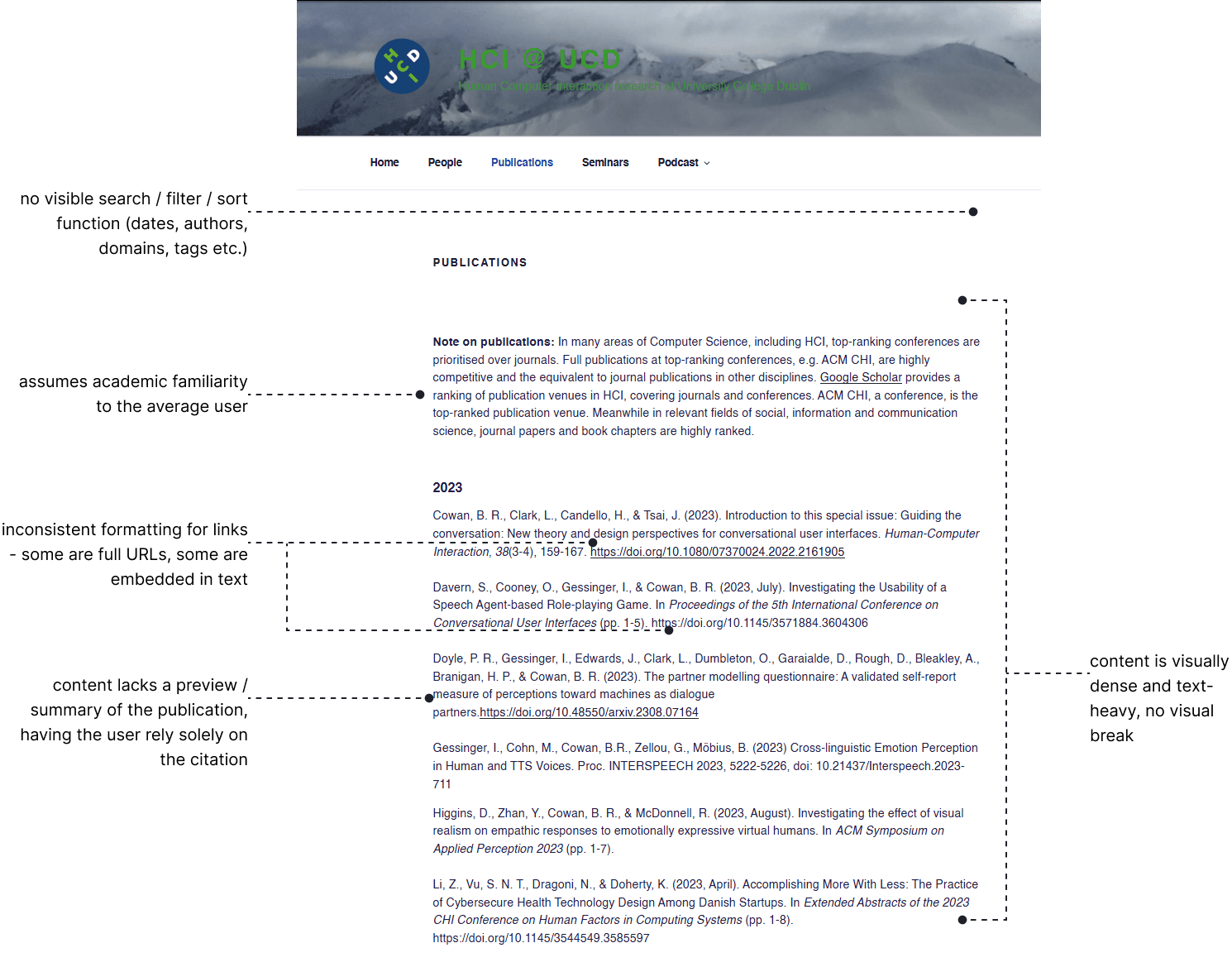
HCI@UCD : Publications_Nielsen’s 10 Usability Heuristics evaluation

HCI@UCD : People_Nielsen’s 10 Usability Heuristics evaluation
* user research
* user research
identifying primary user groups and conducting surveys
In order to conduct qualitative research across various user groups and to understand the key factors influencing their decisions to collaborate with academics from other institutions - such as research interests, expertise, reputation, and existing relationships. Four primary user groups were identified as the main audiences of the HCI@UCD website.

Potential academic collaborators (internal)

Potential academic collaborators (external)

Prospective MSc/PhD students

Alumni
primary user groups
conducting surveys
To develop a deeper understanding of the needs and motivations of the user groups, online surveys were distributed across the primary users. The survey questions ranged from establishing the individuals' motivations to engage with HCI@UCD, and how the group has helped them in their professional journey, from securing funding to collaborating with diverse researchers.
Academic collaborator (internal)
The HCI@UCD group is a shining example of the capacity for cross-disciplinary collaborative research to produce human-centred digital technologies shaping each of our lives for the better.
I enjoy working with other people and seeing how we can combine our interests to do something new.
Academic collaborator (internal)
Alumni
I completed my PhD and postdoc at UCD and chose to stay because of its strong interdisciplinary research environment. With collaboration across many disciplines, it’s an ideal place for impactful research.
Its reputation, overall ranking, course structure and offers me scholarship to cover my tuition fee.
Current MSc student
primary user groups
Based on insights gathered from user surveys, benchmarking, and a heuristic evaluation of the existing website, several key problem areas were identified that needed to be addressed through the redesign of the HCI@UCD website.

brand language and storytelling

design system for consistency and scale
information architecture

visual design and engagement

need for contextual cues (CTAs, tags etc.)
key problem areas as identified
* define: the information architecture
* define: the information architecture
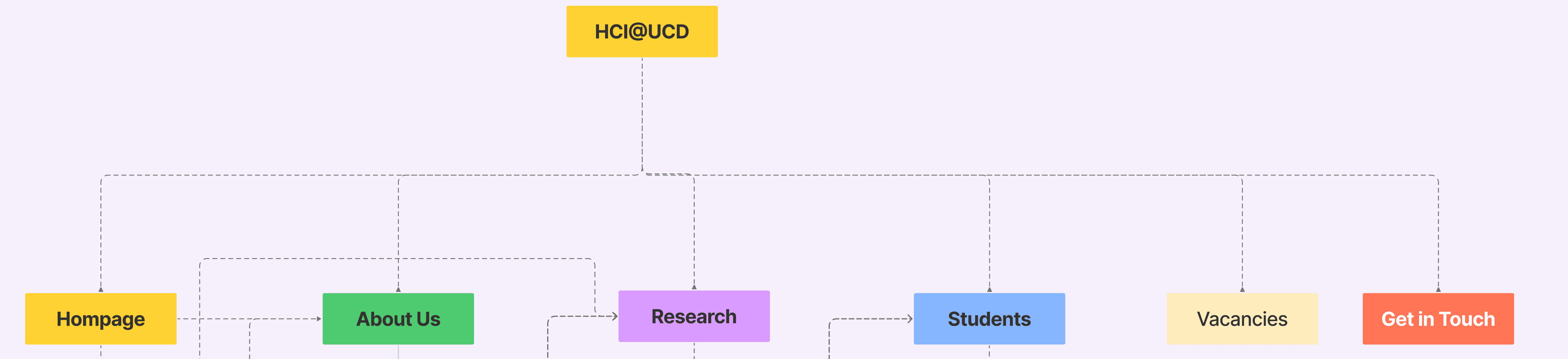
We designed a content structure that captures the breadth of the group's work while enabling intuitive, user-centered navigation. The information architecture (IA) is guided by typical user flows -from the landing page through to the 'Get in Touch' section - ensuring relevant content is presented at the right moment, with accessible links that encourage deeper engagement. It has been optimized for clarity, ease of use, and visual appeal, aiming to reduce cognitive load and support recognition over recall.
01 | Improved Content Structure & Navigation
One of the major weaknesses identified in the heuristic evaluation was the lack of intuitive navigation and a coherent content structure. The revised IA addresses this by clearly organizing information into thematic, user-friendly sections.
content is grouped into clear sections: homepage, about us, research, students, vacancies, get in touch
each page has a consistent layout structure, including footers for seamless navigation
logical flow from landing page to contact enhances usability and orientation
modular page design improves content discoverability and visual hierarchy
02 | Enhanced User Engagement & Control
The previous site lacked opportunities for interaction and user engagement. The updated architecture integrates targeted calls to action (CTAs) and interactive touchpoints throughout the site.
dedicated CTAs encourage active engagement
“testimonials” and “achievements” sections build credibility and connect emotionally with users
social proof (e.g., logos of collaborators) included to reinforce trust and legitimacy
clear paths for different user types (e.g., researchers, partners, students) allow for tailored user journeys

03 | Increased Recognition & Reduced Cognitive Load
The redesign prioritizes recognition over recall by structuring information to be more scannable, visually digestible, and contextually relevant, directly addressing the heuristic shortcomings of the original design.
summary-level content (e.g., bios, research tags, brief overviews) makes it easier to scan and understand
content is placed contextually with accessible links and logical progression
structured sections like “overview of schools” and “project portfolios” aid in recognition and reduce decision fatigue
* defining the branding guidelines
* defining the branding guidelines
A comprehensive set of branding guidelines was developed to establish a clear, cohesive visual identity for HCI@UCD. The process was rooted in understanding the needs and perspectives of key user groups - researchers, students, collaborators, and external audiences - through conversations, feedback sessions, and stakeholder input.
To ensure relevance and alignment with global standards, we also conducted a comparative analysis of branding strategies from internationally recognized public institutions and interdisciplinary research groups. The resulting guidelines define a consistent visual language - covering color, typography, layout systems, and tone - that reflects the group’s collaborative, forward-thinking ethos while enhancing clarity, accessibility, and engagement across all touchpoints.
BRAND PILLARS
These identified brand pillars support the development of the visual branding and content style guide. They reflect the most dominant themes observed across the diverse research works of each member. Following these brand pillars ensures that we communicate the group’s collective focus while still capturing the essence of each member’s work.
creative
collaborative
bold
impact
WRITING STYLE GUIDE
At HCI@UCD, our voice is how we let our brand personality shine through our words. It stems from the four brand pillars: Creative, Collaborative, Research with Impact, and Bold.
forward-thinking and inspiring
collaborative & inclusive
bold & visionary
TYPOGRAPHY
SPACE GROTESK / HEADING
Space Grotesk embodies a clean, minimal aesthetic paired with a modern yet professional feel. Its sharp edges and balanced proportions strike a perfect balance between creativity and formality. This font aligns with the forward-thinking values of HCI@UCD.


KARLA / BODY
Karla complements Space Grotesk, creating a seamless visual hierarchy. Its warm and approachable nature offers a perfect contrast to the modern sharpness of Space Grotesk. With balanced letterforms, Karla ensures a comfortable and engaging reading experience.


VISUAL REPRESENTATION
The colour palette is derived from the HCI@UCD logo ensuring a strong connection to the brand’s core identity. These bold, impactful colours make a powerful visual statement, reinforcing the innovative and professional ethos of the university’s HCI program.


* designing lo-fi prototypes
* designing lo-fi prototypes
Early sketches and wireframes were created to explore layout options for key sections including the homepage, people directory, research areas, and project pages. Each iteration experimented with different approaches to presenting information, leading to the development of four distinct homepage versions. These were tested internally and shared with stakeholders for feedback.


* designing hi-fi prototypes
* designing hi-fi prototypes
When presenting the low-fidelity iterations to stakeholders, it became clear that a visual design combining modern, futuristic elements with a clean and minimalist aesthetic would best represent the research group. Stakeholders also suggested valuable additions - such as incorporating a timeline highlighting the group’s history, and making resources like podcasts, survey questionnaires, and GitHub libraries publicly accessible through the platform. Based on this feedback, the design evolved into the version presented below.
visually interactive and engaging design for the landing page clearly establishing HCI@UCD, and the context for its working
an updated about us page which clearly communicates what HCI@UCD represents, what their values are and introduces the team
* design handoff
* design handoff
To ensure a smooth design handoff, mobile-responsive and WordPress-ready files were delivered, along with fully functional, developer-friendly design assets. A comprehensive design system was developed and implemented to support scalability and seamless integration across the site. Detailed handoff guidelines were provided to maintain consistency in layout, typography, and overall user experience.
* reflections
* reflections
Redesigning the HCI@UCD website was an opportunity to create a meaningful impact within the academic and research communication space. This project challenged me to apply UX thinking to an EdTech/academic platform while working within real-world constraints, such as technical limitations, stakeholder expectations, and content-heavy structures. Through close collaboration with the research group, I focused on improving usability, discoverability, and public engagement - ensuring that the website not only communicates the group’s work clearly, but also supports strategic goals such as partnership building and student outreach.
This process helped me translate the group’s values and multidisciplinary identity into a structured, modern, and scalable design system. It was a chance to advocate for clarity, accessibility, and intentional visual storytelling - turning a static site into a more engaging, functional, and human-centered experience.
learnings
01
simple + strategy + communication = meaningful user experience
Given the vast amount of information that needed to be communicated, prioritising storytelling and effectively representing what HCI@UCD stands for, pushed me to balance form along with function to turn into meaningful experiences.
02
ask questions and be curious
Understanding what the website meant to different users - and the context in which the previous design was created - was important. By asking these questions, I was able to uncover not just what wasn’t working, but why. This helped me explore how the platform’s identity could evolve meaningfully, grounded in both its past and future potential.
limitations
01
technical constraints
As the site was being implemented on WordPress, I had to design with limited flexibility in interactions and layouts.
02
user testing opportunities
Due to time constraints and academic contexts, there was limited access to real users for testing the prototypes. Hence, the feedback relied on internal evaluations with limited external validation.
Back to top
I love designing.
It makes my heart go fast.
Find me here
Thank you for visiting my portfolio. Made with love and cold coffee.

Updated May 2025.
Copyright Notice
© 2025 Rutuja M. Pote. All rights reserved.
Unless otherwise stated, all content on this website - including designs, text, images, and graphics - is the intellectual property of Rutuja M Pote.
No part of this website may be reproduced, distributed, or transmitted in any form or by any means, including copying, downloading, or sharing for commercial or public use, without prior written permission from the copyright holder.